I contributed a lot of work to this project, as did Jack and Emilio.
PRE-PRODUCTION:
Helped to make the props, such as the slot machine.
Gave lots of influential research examples for our website, album cover, and music video. For example, I gave the example of Alvvays's website as one that has a similar aesthetic to the one we hope to achieve.
Helped in getting people together for the Saturday shoot with an ensemble cast.
Helped to come up with ideas or a music video int he very beginning of the project.
Came up with some good tracks when deciding our track of choice.
Contributed ideas towards the shot list and set-up list.
Helped to create flat plans for the digipak panels and for the website.
PRODUCTION:
Performed as the lead singer of the band.
Helped with creating the lighting set ups and filming the actual shots.
Took photos of the other members of the band during the promo shoot.
We did a test shoot in order to test how our ideas, lighting set-up, and shot framing would work on camera before the real shoot. This meant that if we needed to change anything,we had the time to and it wouldn't waste time on the real shoot. Additionally, it meant we could test how our performances looked on camera.
The test shoot revealed things we needed to change about our set-ups. For example, the Singin in the Rain lighting set-up had really nice lighting in real life, but on camera it made our faces too dark, and did not show the lights from the lamppost well enough. We then changed the lighting to a mix of white, yellow, and red lights so that we could light up the centre stage, but still achieve the colour we wanted.
Me checking the lighting on the Koolertron monitor.
Me checking my performance in between taking shots.
Jack coaching me with performance to make sure I get the look and feel of the character right for the video.
One of the things that did work on our test shoot was our band's performance. the test shoot showed that our performance worked on camera with the light pink lighting and the different framing, and that our performances looked accurate. Also, the fun relationship between all the band members really worked on camera, and we were good at making our sibling relationship look fun and silly.
Here is one of our test shoot band shots, complete with costumes, props, and lighting.
We combined our call list with our shoot board, as it was easier to see who was needed, when and why. For example, we could see what shot we were doing at a certain time and then quickly and easily reference the call sheet to find out who was needed.
Page 1 of our shoot board, which includes the call sheet. See "R+P Post 20: My shoot board" for the full shoot board and call sheet.
WHY A CALL SHEET IS IMPORTANT:
We can tell other people in advance when they need to be in the studio and what they need to do. For example, Tom is not in our media group, so we gave him a copy of the call sheet so that we could ensure he would be in the studio when we needed him. Additionally, we used Lily as our make-up artist, and she also doesn't do media A2, so we gave her a copy so that she would know where to be and when, and what make-up she needed to bring.
We created a shoot board so that we could stay organised on the shoot, and to make sure that we wouldn't miss any shots that we had planned to take.
We created our shoot board set-up by set-up, as well as based on the times our actors and make-up artist were available. This meant we needed to include our call time for all the people who needed to be there.
Here is a presentation of our shoot board pages in order.
PROS OF MAKING A SHOOT BOARD:
Helps us to stay organised on the shoot.
Ensures that we take all of the shots that we need in the amount of time we have.
Allows us to set up the studio in advance and tell people when they need to be there.
We decided that we should do rehearsals for some of our shots because some of the scenes involved dances and movement sequences that were complicated for us to do considering none of us have any dancing experience. The biggest challenge was choreographing the movements for Singin in the Rain and Mortal Kombat. The dances for Singin in the Rain were difficult because we needed to keep the framing tight while also doing big dances with umbrellas around a lamp post. This meant that we often went off frame even when we did get the movements right. Additionally, it was difficult to use the umbrellas gracefully in the dances, so we really had t practise that. The Mortal Kombat movements were quite difficult to get nicely on frame, as the power bars were difficult for jack and Lily (our make-up artist) to manoeuvre smoothly, and to keep their bodies off frame. We also rehearsed the fight sequence Emilio and I were to do so that it would be clear in the narrative for the audience and also look smooth on camera.
Emilio and I rehearsing our fight scene during the test shoot.
BENEFITS OF REHEARSING:
Saved us lots of time in the actual shoot, as we already knew what we had to do and how.
Got us performance-ready, so that we were used to our characters and how to act as a part of a band.
Allowed us to make sure that our dances looked neat and professional.
For our shoot, we were lucky enough to have access to our school's professional standard equipment, including a Canon 5D camera, which enabled us to produce high quality footage, taking in the detail of all the lighting, costumes, props beautifully. It also had a manual focus lens, which allowed us to tamper with the depth of focus, and allowed us to get really nice crisp shots.
The lighting desk was really useful because it allowed us to create full-colour lighting set-ups with different colour mixes and light intensities depending on the scenes. For example, for the Singin in the Rain shots we used mix of yellow and red lighting at a low intensity so that the camera could pick up the lights on the lamppost as well as having our faces well-lit.
The sound desk was also a very useful piece of kit because it allowed us to play the song while performing, which helped with our performance standard and definitely with my lip-syncing. Also, it meant that when we were setting up and packing away the kit, we could listen to music on the speakers.
The Samsung TV monitor and the Koolertron monitor were both incredibly useful as well. The Koolertron monitor made it really easy to see the screen and test how the lighting set-ups looked like on the camera, as the built in digital screen on the camera was too small to be able to accurately focus and see the footage quality. The Samsung TV monitor was useful because we could see it when we were performing, helping us to stay in frame when and make sue our performance was up to standard, and it also meant that when creating the lighting set-up, we could see how the colours looked on screen from the lighting desk (although it is not as accurate as the Koolertron monitor in terms of colour).
We chose to use Emilio, Jack, and me as the band members, as well as Tom Brown, who did media AS with us last year. This is because we all have similar free periods, and we know we are all going to be dedicated to the shoot and our performances.
Me as Casey Tyler.
Casey Tyler - We cast me as Casey Tyler because she is an energetic character, and it is much easier having a group member as the lead. Additionally, I have been involved with drama things in the past, so I am a confident performer. We decided to make a screen test in order to make sure I matched the role of the lead singer.
This is our screen test. We thought that my lip syncing matched the voice, and that with a bit of extra training i can portray Casey's character well.
Jack as Hugh Tyler.
Hugh Tyler - We cast Jack as Hugh Tyler because he is the second most important in the band, and we are confident in Jack's performance skills as he does A2 drama and is always amazing in the school production. Additionally, we wanted to show Casey and Hugh as having close, friendly relationship, and this would be easy for Jack and me to pull off as we have been close friends for years. Jack was also the bass player in the music video remake task, so he has had practise in playing the guitar to the music convincingly.
Tom as Terrence Kitchener.
Terrence Kitchener - We cast Tom Brown as Terrence because he is an ex-media student, so we know he will take the role very seriously, and he plays the piano, so can play the keyboard convincingly in the video. We also tested to see how he would be playing the keyboard in character, and he was very confident, and pulled off Terrence's smug expressions extremely well.
Emilio as Guy Chapman.
Guy Chapman - We cast Emilio as Guy because he has had experience performing in the music video remake prelim, and also has a drum kit at home so has had practice with using a drum kit. This would mean his performance as the drummer will look very natural, and he was very good at portraying Guy's quietness, while also conveying Guy's love for the music and expertise in playing the drums.
Our full cast for the party scene.
Party scene ensemble - We all invited friends to come in on the first Saturday of shooting to be part of the ensemble. Because of this, our cast consisted of the people who were willing and able to dress up and dance on the day. Our ensemble was eventually just five extra members: Ray Baker, Lily Mo Browne, Hugo Perrot-Barnaby, Caleb Wycoff-Smith, and Luciano Francischelli.
We decided to film our whole music video using our school's professional standard studio complete with a white cyclorama, as it would suit our narrative structure, and allow us to have the highest quality music video possible.
Pros of using the studio:
Gives us a large space for us to move around in.
Has a minimal back drop, drawing the audience's attention to the performers and the props.
Allows us to use different coloured lighting to portray different scenes.
We do not have to get permission for filming on location.
We had different lighting set-up in our music video to reflect the different scenes in the narrative.
Our lighting was inspired by Jessie J's Price Tag.
PROPS:
Taking inspiration form Sia's You've changed, we decided to go for the hand-made aesthetic with our props, making them ourselves out of cardboard. We collected lots of cardboard over the course of our project and brought it all together at Jack's house during half term so that we could make the props. As the slot machine was the biggest prop, I made it at my house and brought it into school separately from our other props. The slot machine body was made from cardboard, the arm from a poster tube, and was finally painted by all three of us in school. The props we needed to make were the Mortal Kombat power bars and the "K.O" and "FIGHT!" signs. We made a brief plan for each of these before making them, then we created them with cardboard and painted them with acrylic paints at school.
Our other props included a blanket, a Gameboy, a Sgt Pepper vinyl sleeve, a Singin in the Rain VHS tape, and more. These were used in the scenes where Casey s awake, and not in a dream. The contrast between the two sets of props (the dream props being hand-made) highlight the fact that Casey is in a dream, and that it is all created by her mind. This strengthens the narrative and creates a clear divide between the dream world and the real world, helping the audience to understand the narrative.
SET DESIGN:
Keeping our cardboard aesthetic, we made most of our set design out of cardboard. Our main pieces of set design were the tree, mirror, lamppost, and sofa. The sofa and the mirror were the only items that weren't hand-made, as they would be too difficult to hand make in the time we had and we already had good access to a sofa and mirror anyway. We made the tree and lamppost at Jack's house, along with the props, and used his old swing ball pole as a base for both of them. In order to cover it, we made 2 tubes of cardboard (one for the lamppost and one for the tree) to cover the pole so that they were easily interchangeable depending on what scene we needed to shoot.
We decided the type of costume we were going to go for is the smart/casual look mixed with a pastel aesthetic.
Costume ideas page 1
Costume ideas page 2
We decided that we would convey the dream in the narrative by having a separate set of costumes for each character when they are in the dream. Additionally, the dream costumes would portray each of the band members as their alternative character. For example, Guy Chapman wearing the outfit of Scorpion from Mortal Kombat when in the dream sequence. As for the band costumes, we decided to follow a similar aesthetic to that of Echosmith. The feedback we got from our target audience when asked about the band costumes included"the costumes make the band look like they belong together", which is definitely something we wanted to achieve.
OUR FINISHED COSTUMES:
PROPS:
Props list page 1
Props list page 2
We made a prop list based on the different set ups we planned for our music video, then decided who in the group would take responsibility for each prop. I was in charge of making the slot machine, bringing the Gameboy and blanket. We chose to make most of the props from the dream because it continues our hand-made aesthetic, and saves a lot of money.
MAKE-UP:
We decided to go for minimal make-up, but decided on similar looks to go for. We then gave our make-up artist references to use when doing our make-up.
We took inspiration for our digipak panels by looking at
other indie pop group album covers. This helped us to identify the specific
conventions for our genre.
We each came up with some ideas and plans of digipak panels
that we thought would make an album cover that stands out from the crowd while
also fitting in with convention and conveying our band’s branding, style, and personality.
We then had a group meeting to discuss elements of each of our ideas that we
liked and didn’t like.
Ideas we liked:
Creating a thin border around the front panel. This has been
done by Echosmith’s Talking Dreams.
Using promo shots on the inside sleeves of the album. This
would help to emphasise our image, and using these shots would show us off as
not just a band, but a close group of friends.
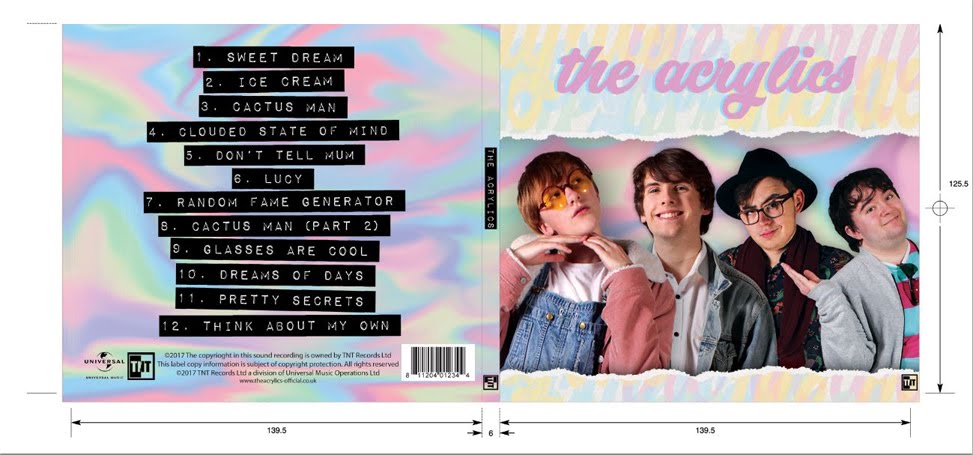
Having Casey Tyler as the biggest part of the focal image,
but also incorporating images of the other band members. This would show her
off as the lead singer, while also showcasing the band. It is conventional for
a debut album to feature a focal image showcasing the artist, as it allows the
audience to engage in the new band without having previously been invested in
the music.
Using a simple background with bold text for the song titles
on the back cover of the album. This makes the song titles easy to read and
accessible to all audiences, but also with a simple and distinct style.
Creating a hand-drawn logo of the band name and placing that
on the front of the album cover. This also continues our band’s aesthetic, and
clearly states who we are, informing the audience.
Here are our preliminary plans:
Album 1 exterior.
Album 2 exterior.
Album 3 interior.
Album 3 exterior.
Album 4 exterior.
Here is our final, rough plan:
Exterior.
Interior.
It consists of a focal image of each of the band members
descending in size, in order of importance to the band; Casey, Hugh, Guy, then
Terrence. Additionally, there is a simple, hand-drawn background and logo,
conveying our image and branding, whilst also informing the audience of who we
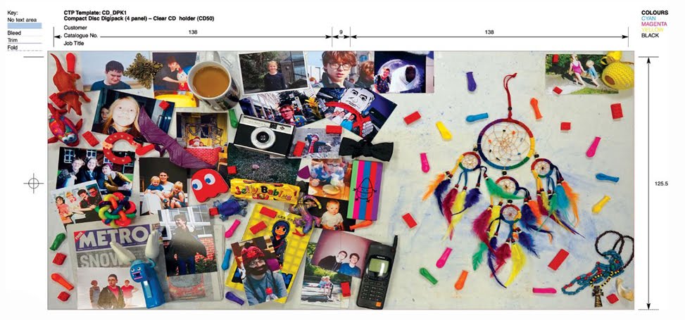
are. The inside panels will have photos of the band member’s being shared over
a table, highlighting the friendship amongst the members of the band, and
providing the audience with some extra content that will engage them in our
band. The back cover is bold lettering (possibly cut out from a magazine/pieces
of paper) over a simple, hand-drawn background. This is easy to read, and
extends the band aesthetic and branding.
Our audeince feedback told us that it was important to have all of our band members shown on the front cover of the digipak, as it gave them a sense of the band. We also found out that the audeince like a visually engagin inside panel that complements the music, which is why we have chosen to go with the covered table inside panel.
To plan our web pages we had many group meetings in which we discussed our website influences, conventions, and style elements that we would like to include in our website.
Website plan 1.
Website plan 2.
CONVENTIONS WE WILL INCLUDE:
A homepage dominated by a focal image/video of the band members. More prominently of Casey Tyler. We will do this by adding an interactive click-through of different images and videos on the home screen.
A start page before entering the website that promotes the most recent album. This immediately shows the audience that they can buy the new album, and it will be available on mny platforms such as iTunes and Google Play.
Links to the band's social media accounts (conventionally Tumblr, Twitter, Facebook, Instagram). We will do this with icons at the top of the page that take you to the social media pages when clicked, as well as embedding their most used social media account into the homepage.
Links to a music page, purchasing opportunities, the distributor's website, and a homepage in a bar across the top. We are planning on making the website format so that when one of the links is followed, it automatically scrolls you to that section on the main page, instead of having many different pages.
This is our final rough plan for our website.
We have chosen this design because the audeince feedback we took showed that our audience will appreciate a highly interactive website that engages them constantly. This design achieves this by having a click-through gallery and other features such as a contest.
We planned to take two sets of promo shots: one set in the
studio, and one set out and about. This would show that our band is serious in
music, but also has character. Additionally, it would help to show off the
individual band members’ personalities a bit more.
Firstly, we planned our promo shot schedule around the times
when we were all free (including Tom). Unfortunately, Tom was only free in one
period of school at the same time as the rest of us, so we took that as an
opportunity to take shots of just him, and some shots of the band together in
the studio. Jack, Emilio, and I all had similar frees, so we were able to take
promo shots out and about of each of us, as well as some of Jack and me; this
would highlight Hugh and Casey’s sibling relationship.
We plan to take a range of shots in different poses, with
different props/accessories, and different framing. For each band member we
took shots in CU, MCU, MS, and LS, to make sure we would have enough photos to
use in any circumstances. We also took some photos of Casey on the floor of the
studio, a conventional photo style for a female artist. Additionally, Emilio
allowed us to use his Nikon camera when taking shots out and about, with lenses
that allowed us to play around with the depth of focus to create some really
aesthetically pleasing shots that suit the edgy/indie aesthetic we are hoping
to achieve.
Here are some example promo shots that inspired our choices:
All of these promo shots cntain all the members of the band portraying their aesthetic and the personalities of the band members. For example, the bottom-left photo of Echosmith shows all the band members smiling in laid back positions outdoors. This shows their positive, laid back personalities, and creates voyerism between the band and the audience. Additionally, they are all sitting close together, showing how close they are with each other, as they are all siblings.
We made a story board so that we could visualise our shot ideas for the music video so far. Our music video will contain lots of fast paced editing and a wide variety of shots, so we made our storyboard contain only the key shots we plan to include in our music video.
Story board page 1
Story board page 2
We made our storyboard using post it notes so that we could easily rearrange, add, or remove ay shots we felt necessary. Additionally, each different colour represented a different type of framing; yellow is CU, blue is MS, green is LS. Each of these contained every type of this framing (eg under LS there could be an ELS or an MLS).
PLAN FOR BAND SHOTS:
Handheld individual shots of each of the band members playing.
MS, LS, and CU of each of the band mambers playing.
Handheld shots of whole band.
LS, MS, and CU of whole band.
Our influence for these shots came mostly from Echosmith's Cool Kids, which had a rnage of band and solo shots filmed both in handheld shots and in stationary shots.
Band shots from Echosmith's Cool Kids.
PROS OF MAKING A STORYBOARD:
Allows us to plan exact shots we want in our music video for each scene.
Allows us to visualise our narrative and ideas for the video really well, including helping us pin down costumes, props, and lighting set-ups. This meant we could prepare well for pur shoot.
Helps us to make sure we have a good variety of shot content and framing, to ensure we keep the audience's attention and engage them with interesting visuals.