Here is my Music Video:

Here is the outside panel for my digipak:

Here is the outside panel for my digipak:

Here is the inside panel of my digipak:

Here is the inside panel of my digipak:

Here is my website:

Here is my website:
Please click the image to follow the link to our website.

Friday, 22 December 2017

Construction Post 6: Website Post-Production

Jack was leading the construction of the website, which involved using Wix.com to create an interactive website that wold appeal to our target audience. It also needed to include purchasing opportunities, information about the band and album, and our brand aesthetic that would synergise with the album cover and music video.

The website was created using Wix.com, a website that allows the user to create an interactive website of their choice. It had a variety of different layouts, which meant we were able to create a blog-style website similar to that of Alvvays.

Allvays's blog format website.

We also used some tools that were adjustable to our needs, such as photo galleries, social media links, and an online store.

MY CONTRIBUTION:
  • I helped to edit photos for publish on the website, including spot-healing and skin-smoothing the models.
  • I also helped by creating some of our merchandise, such as the band logo phone cases.
WHAT I LEARNT: 
  • I was able to gain a deeper understanding of music websites and how they work to get the audience to endorse in the brand. For example, I learned that a pop-up window when opening the site would immediately give the audience a purchasing opportunity and would likely earn the band more money.
  • I also gained an understanding of how a website synergises with all the other products in order to connect the brand together. It does this by creating an online hub to sell all the products and to appeal to the target audience.
This is the homepage for our finished website. It has a toolbar at the top that scrolls down to each section of the website when clicked. The social media panel follows the user down the page. The main focal image is a flick-through gallery of different promotional offers.

Our audeince were all very engaged by the interactive opportunities on our website, and one audeince member pointed out the contest in particular as being very exciting. This means we have effectively raised excitement among the target audience, and kept them engaged with our band's image.
Our teachers also said the interactive opportunities were effective, and that the way we were appealing to our target audience with an interactive and therefore engaging campaign was very effectiev for a modern-day audience.
Construction Post 5: Digipak Post-Production

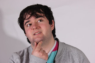
Me photoshopping the digipak.
I took the lead when creating our 4 panel digipak. This included editing together promo shots, images, and other graphics to create a realistic album cover that represents our band, brand, and our music.

THE STEPS I TOOK TO MAKE THE DIGIPAK:
  1. First I chose and cropped photos of each of the band members. 
  2. I then graded and positioned each of the band members on the album cover. At this point we were still deciding our exact design, as we hadn't planned exact spacing of the models before (we knew they would be a different size to how we were expecting).
  3. I created a background for the album cover using the paint, smudge, and burn tool on photoshop. This allowed me to get an inky effect on the background, adding to the dreamy aesthetic of our album cover.
  4. I chose fonts to use for the song and album titles that would suit our band's aesthetic.
  5. As a group, we took the photo for the inside of the digipak, which would take up both inside panels. The photo was of a table covered in items that were related to our band and our album, such as photos and objects from our past.
  6. I graded the photo for the inside panels of the digipak so that it appeared more saturated and clear.
  7. I added some of the finishing touches, such as a bar code, copyright symbols, and extra bits of grading to solidify the aesthetic.
THE CONVENTIONS WE INCLUDED:
  • Album/band name
  • Focal image of our band members
  • Bar code
  • Copyright symbols
  • Record label logo
  • Song titles
WHAT I LEARNED:
  • I learned a lot about using photoshop, because although I had already used it a lot in the past, I found that this project allowed me to develop my creative skills with photoshop, exploring different ways to create things.
  • I also learned a lot about the conventions of an album cover that I had not previously considered. For example, I had never previously thought about copyright and record label on an album cover, but this project showed me the importance of informing an audience of the institution aspect of music. 
These are the interior panels of our digipak. On the left are many objects and photos that link to the album. On the right there is a dream catcher, referencing the single on our album, while also being a subtle piece of imagery once the CD is removed from the case.
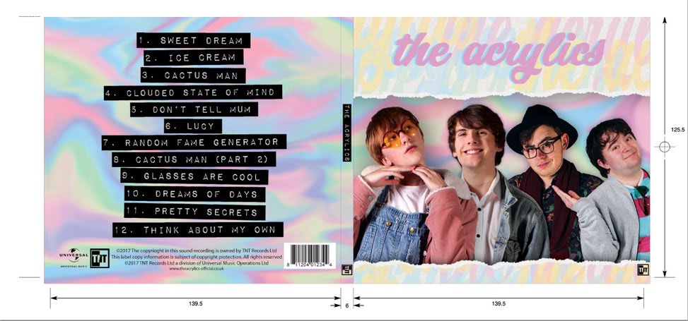
These are the exterior panels of our digipak. The right is the front of the album cover, and includes a focal image of our band wiht the band name on it. The spine simply says the band's name and the record label. The left is the back of the album cover, and has a list of song, a bracode, copyright symbols, and record labels.
Our audience members all thought the album cover effectively portrayed the album's genre through the use of bright, pastel colours, and the focal image of our band members. Additionally, they all thought that all the information was very clear and easy to acces, such as the band name and the song titles, as well as the record label logo.
Our teachers also said that the information was very clear on the album cover, and they both agreed with the fact that the inside panels work well with the music and the theme of the album.

Construction Post 4: Music Video Post-Production

Emilio was the person in charge of this aspect of the project, although we all helped in creating the finished music video. We all started the music video together by going through all the footage we had taken during the shoot, labelling it, and deciding which were the best takes to use.
Me editing the music video.

The next step in the editing was to create a rough edit of the entire music video, pinning down some of the backbone shots. This meant filling in the majority of the narrative following the Singin in the Rain scene, the Sgt Pepper scene, the Alice in Wonderland scene, and the Mortal Kombat scene. This meant that we would be able to place the filler perfromance-based shots later, when we can see how the timing works out.

After this start to the project, we left the music video grading and other finishing touches up to Emilio, which involved grading each shot and creating fast-paced sequences of editing and graphics.

MY CONTRIBUTION:
  • I helped with the editing of the music video, such as by helping to create the rough-cut and narrative.
  • I also helped to make decisions on some foreground editing, and different effects used in the video.

WHAT I LEARNED:
  • I lerned more about the editing process of a music video, which does not have a rigid story board. I learned that you don't need to follow a story board in order to create a high quality product, as it depends on the footage you have taken as well as how it all looks and fits together once in editing.

This is our finished music video.

Our audeince were all very engaged by our music video and found the intertextual references particularly engaging. Many of our audience also really enjoyed the narrative of the music video, and were all very engaged by it.
Our teachers said this looked like a real-life product, and after changing some cuts after their realsiation that they did not create fluency in the video, I think we created a high-standard finished music video.

Construction Post 3: Week 3 Production

We spent the third week of production taking any final promo shots for our website and social media pages out and about on location. This included having the band members be in costume and going out and taking photos in various locations. We chose a park as one of our locations as it shows the more human side of our band members, extended the authenticity of our band, as well as a bus stop for another location, which helps with the authenticity and emphasises the fact that we are based in London, which will help to appeal more to our London audience. We were able to use Emilio's Nikon camera and various lenses to take the photos, which meant we got a nice variety of professional standard shots with different depths of focus to help the shots synergise with our band's brand and aesthetic.

Casey and Hugh Tyler in a tree.
Our audience feedback showed that these photos were specifically relatable to a London audience, making the band seem more authentic and appealling. They also thought the band seemed really cool in their outfits around suburban areas.
Our teachers both said that these promo shots showed a great deal of personality from our band members, therefore appealing to our audience by creating voyerism.

WHAT I LEARNED:
Hught Tyler in front of a bus.
  • I learned how to use some of the different lenses that Emilio had brought, which I found very interesting and useful. This has widened my knowledge of photography and has allowed me to have a greater understanding of photo composition and style.
CHALLENGES WE HAD TO FACE:
  • We needed to stay safe when shooting with an expensive camera on location, so we stayed mostly in open public spaces and we were well-behaved around other members of the public.
  • Tom was not available for this shoot session, so we had to work around that by mostly taking shots of Hugh and Casey, as they are siblings and the front members of the band. 
MY CONTRIBUTION:
  • I took photos of Emilio and Jack when I was not in the shots, including some of Guy Chapman on the swing.
  • I modelled in many of the shots that involved Casey.
  • I helped to choose locations for the shots that were appropriate and safe for our shoot.
  • I helped to plan and direct our shots so they looked authentic and suited our brand.

Tuesday, 19 December 2017

Construction Post 2: Week 2 Production

Week 2 of production was focused on getting our photo shoot for the album cover complete. This consisted of taking high-quality photos of our band members in costume against a white background in high-key lighting. To do this, we were able to use the mini-studio set up in our school that had lighting units, diffusers, and a white wall in order to get the best quality photos possible. We took a variety of shots for each band member in many different poses and framing. The group shared out roles evenly and we all hoped each other with the technical aspects of photography.

Jack in the photo shoot.
Tom in the photo shoot.


Emilio in the photo shoot.

I think our photo shoot went successfully, as our aaudience seemed to really like the photos and how the band showed a lot of personality in them.
Our school technician also said they were all technically good, with good lighting and focus, while our teachers said they were appropriate for a band website and album cover.

WHAT I LEARNED:
  • I learned how to use the digital camera in conjunction with the synchronised lights to take a high quality photo. For example, I know now that when using a bright flash, to set the ISO to a low number like 100 so that I can achieve a high quality photo with  nice lighting.
  • I also learned how to work efficiently in a photo shoot, which will definitely benefit me in later life. For example, I learned how to quickly fix lighting issues (by changing the intensity on the lighting units, rather than any camera settings).
CHALLENGES WE HAD TO FACE:
  • We didn't have a lot of time to take our shots, as we were only scheduled in the timetable for using the mini studio for a few periods. This meant that we had to use our strengths to work efficiently so we could get a large variety of shots that we could use in both the album cover and the website.
  • It was difficult to take candid looking shots of the band members during the studio photo shoot because it felt quite unnatural for the people in front of the camera. To overcome this, we had conversation between all the people present, mostly with whoever the photographer was at the time, to help ease the person into the role and look more relaxed on camera. 
  • We only had around half an hour to use with Tom. This meant we really had to plan our photo shoot in advance to make sure we got everything done in time to be prepared for his shots, as they were in our last slot. Luckily, we had finished all of our other shots by the time Tom arrived, so we did not need to rush to much and we were still able to take a wide variety of shots with him in.
MY CONTRIBUTION:
Me as Casey Tyler during the photo shoot.

  • I took some of the photos that I wasn't modelling for, including some photos of Jack and Emilio.
  • I modelled for the shots of Casey Tyler.
  • I helped to set up the lighting arrangement, including the placement of the lights and their intensity.

Thursday, 14 December 2017

Construction Post 1: Week 1 Production

Our first week of production was our shoot week. During this week we used the school studio to film all the shots we neededd for our music video using the professional standard lighitng desk, sound desk, and cyclorama for a high quality shoot.

CHALLENGES:
  • Organising an ensemble cast for our first day of filming, which took place on Saturday the 4th of November.We had to make sure they all knew what to do in the video, how to act in the school and how to get to places in the school. In order to keep them in the loop with this sort of information, we gave them all a quick briefing at the beginning of the shoot day, meaning that we would have an easy and efficient shoot day ahead of us. It also meant that the cast were aware of health and safety precautions they needed to take while working in the studio. In order to keep their energy levels high, we provided snacks, music, and frequent breaks, ensuring the best performance we could get out of them.
  • Creating an infinity scene using the cyclorama, as there was an obvious dark line where the wall screen met the paper on the floor. We spent Monday morning trying to fix this using sheets of paper to connect the floor and wall screen, but was still obvious on camera, and made the space look more messy. In the end, we decided it would be beneficial for the shoot and the video to leave the cyclorama with the line between the wall and the floor. We felt this was the right thing to do because all the shots we had taken on Saturday were taken in this set up, and we were unable to retake these. Additionally, we felt that as we were creating and indie and home-made-style music video, the line between the wall and the floor would match the aesthetic of our video. This sort of set-up has been used in other indie videos that have a similar aesthetic to our own, such as Vampire Weekend's A-Punk.
  • Our worst challenge that we had to face happened on the Thursday of our shoot week. We scheduled in a slot of looking back on our footage and checking if we needed to use our back-up shoot slots to fix anything. Unfortunately, we discovered that the footage from Tuesday, our most productive shoot day, was corrupted, and it hadn't transferred to the iMac properly when dumping it. This meant that we had to re-shoot our shots form the Alice in Wonderland and Singin in the Rain shots. Luckily, we had both Friday and Saturday scheduled for back-up shoots, so we had enough time to re-shoot all the footage that was corrupted, although it was a shame to have to re-shoot it. Additionally, all the footage we took after that realisation, we dumped twice and checked the footage thoroughly after dumping it.
Vampire Weekend - A-Punk. This is an indie music video that has a similar home-made aesthetic as our own, and also has an obvious difference between the wall and the floor.

Our audeince feedback showed that this would not be a problem, and many of our audeince members said they wouldn't noticce this with all the other mise-en-scene going on in the video (such as the hand-made props).

Our teachers also did not think this was a problem, as we showed them many other music videos that also have this, and how they have used that lo-fi setting to appeal to their audience.

MY CONTRIBUTION TO THE SHOOT:
  • I played the main character int the video, so did the lip-syncing during band and solo shots, as well as acting as Casey and Casey as Alice.
  • I filmed many of the shots in the scenes I was not in, such as Emilio's solo performance shots and Jack's solo performance shots.
  • I helped to create some of the set-ups, such as the Mortal Kombat set up and the Singin in the Rain set up. This involved using the light desk in order to change the colour and intensity of some of the studio lights in order to get the right feel of the shot.
Here is a slide show explaining some of the ways I helped on set.