Here is my Music Video:

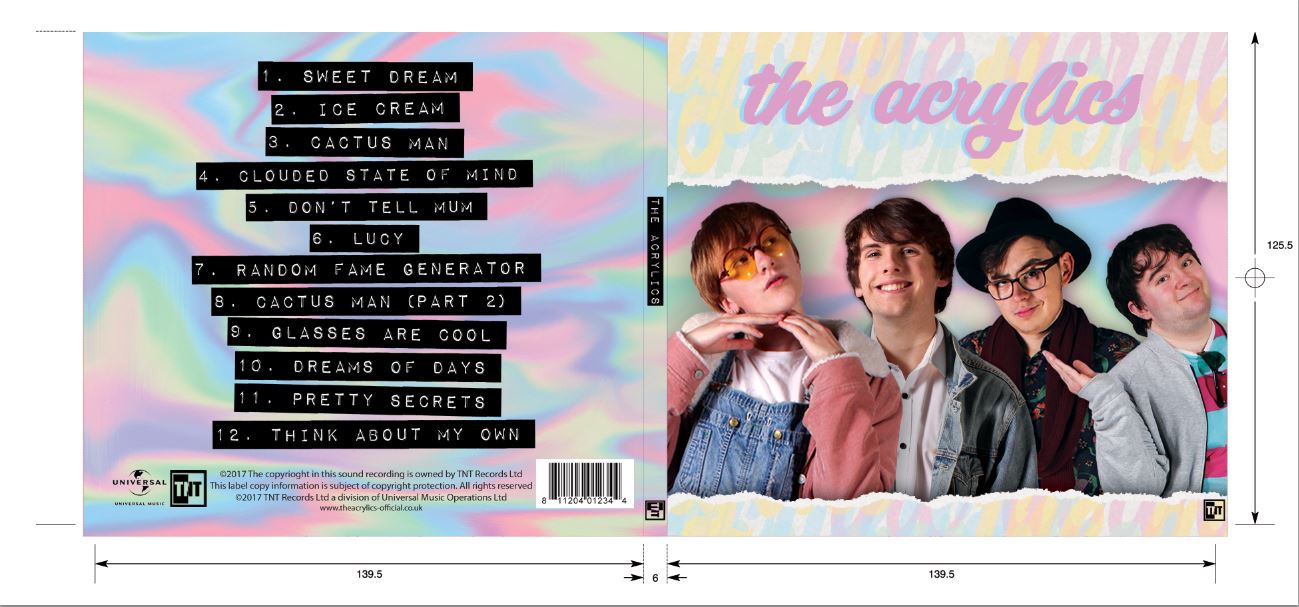
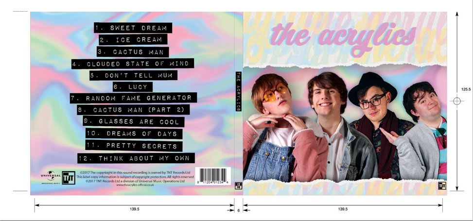
Here is the outside panel for my digipak:

Here is the outside panel for my digipak:

Here is the inside panel of my digipak:

Here is the inside panel of my digipak:

Here is my website:

Here is my website:
Please click the image to follow the link to our website.

Sunday, 7 January 2018

Evaluation Q1: In what ways does your media product use, develop or challenge forms and conventions of real media products?

We have created an indie pop band with a music video, album cover, and music website.

I think that our three products use, develop and challenge the existing forms and conventions of real media products. Although our products are mostly conventional, there are aspects of all three that both develop and challenge conventions. However, we have mostly incorporated music marketing conventions to ensure a professional standard media product that appeals to the target audience.

Music Video:

This is a mindmap of music video forms and conventions:


This is a padlet for Vernallis's music video conventions. It shows how we followed/broke conventions in order to make a professional-standard product.

Our music video follows the forms outlined in Simon Frith's Theory of music videos by having a combination of performance and narrative. Additionally, we have used forms and conventions to fulfill Frith's 4 functions of music in our music video and to appeal to our target audience and the public as a secondary audience.


Website:

In modern society, audiences are more active and engage more with interactive campaigns that involve audience participation. This has been particularly influenced by the invention of "Internet 2.0", which allows the audience to interact with websites with features such as social media that allow the audience to like and share online content. We have therefore created a website that gives the audience many opportunities to interact with the campaign, for example, by purchasing merchandise and music, by partaking in contests, or by using social media in conjunction with the website.

We have used the website to converge our media products including the music video and the album cover. It will provide the audience with information and opportunities by acting as a hub for all of our band's products.


Here is a slideshow of the conventions we used in our website and how we used the form of the website to achieve them:


Best Coast Official Website
Our Website

We have used the form of a website to allow us to follow conventions and to allow us to make an effective product that will appeal well to our target audience.

Album Cover:

The two album covers we took most of our inspiration from were Fantastic Playroom by New Young Pony Club, and Alvvays by Alvvays. Fantastic Playroom is a conventional album cover for an indie pop band, while Alvvays uses its form to express the band's aesthetic and branding.

Annotated album covers (New Young Pony Club, top, Alvvays, bottom). Please click to enlarge the image.

We have used various techniques and conventions to create our finished product, drawing from these two influences. Here are our internal and external digipak panels followed by a table explaining our use of techniques and conventions to make the product.
Our external digipak panels. 
Our internal digipak panels.

A table showing the forms and conventions of our digipak. Please click to enlarge.

Evaulation Q2: How effective is the combination of your main product and ancillary texts?

The point of a band's marketing campaign is to generate interest in the band, and get audiences to buy into the brand and generate profits. Band marketing campaigns are usually funded by the record label, whose main interest is to make maximise profits through the sale of band music, tour tickets, and merchandise. Marketing campaigns in the music industry have changed since the proliferation of new technologies, such as Web 2.0. They have become more interactive to compete with other companies for audiences, who demand interactive and engaging campaigns. It is important to portray a band's genre through the marketing campaign as it informs the audience of the type of music the band make, and also because it will appeal to fans of the genre. This is done through the use of genre conventions, such as colour scheme.

We made sure to use a range of marketing techniques in our campaign, as outlined in this coggle:


As a group, we aimed to create a promotional package with branding throughout all of our products to make our audience buy into our band's brand. The combination of our product and ancillary texts (each with their own purpose in the campaign) all work in synergy to promote the brand and sell the music to the audience. While this is the case, our 3 products work well separately as a marketing technique.

Table to show the function of each product (left) and flow chart to show the marketing campaign (right).


When looking at how the three products work together in a marketing campaign, I studied Best Coast's campaign, as they used a number of above the line and below the line promotional techniques to give the audience opportunities for interaction and purchase.

This is how Best Coast have used all of their products to make a successful marketing campaign.


After looking at Best Coast's marketing strategy, we decided to implement some of the same marketing techniques. These include the release of the single, a music video, album and album cover, live performances, tours, merchandising, website, Facebook page, Twitter, photos and video clips, downloads, competitions, tie-ins with other brands, appearances, news and info, and word of mouth.

Here is a padlet to show how we built up a successful marketing campaign using our three finished products.
Made by Noa

We also made sure to present our band as 'real' and 'authentic' using Dyer's star theory, which shows that it is important for audiences and institutions to have an artist with 'star quality' that will appeal to the target audience.


I think that we used our products effectively to appeal to our target audience, and that the combination of our products meant that we could reach and appeal to wider audiences. We managed to use these products to generate interest in our band and to encourage our audience to buy our products.

Evaluation Q3: What have you learned from your audience feedback?

We took audience feedback throughout research and planning and the production process. This meant that we could make sure our products would appeal to our target audience and be likely to listen to the band's music or buy into the brand.

This is a table showing who the different audeinces are, and roughly how we attempted to appeal to them. Please click to enlarge.

The main theory we used when implementing audience feedback and appealing to the audience was Blumler and Katz's audience uses and gratifications theory.
Made with Padlet

PRE-PRODUCTION:


From our audience feedback on band identity, we learned that every aspect of the band is important in helping the audience understand the artist and the type of music they make, and therefore relate to them. We felt that one of the most important aspects was the band name, as we had many working band names and found that none of these really matched the band well.

An example of a band that has changed it's name to fit with it's image is the Beatles, who have changed their name a total of four times: the Blackjacks to the Quarrymen, to the Beatals, to the Silver Beetles, to the Beatles. This has reflected the changes in band members and therefore the changes in the band's image. The Blackjacks were formed by John Lennon and other members from his school (Quarry Bank High School), but changed their name to the Quarrymen after they found out a local band had the same name. This new name reflected where they all met and the type of band they were. Once Paul Mccartney and George Harrison joined the band, and the other members (apart from John Lennon) left, the name was changed to the Beatals, as the Quarrymen no longer fit this new group of people. They then kept changing their name until they got to the Beatles, a name which reflected their music and personalities well.

We successfully used our pre-production audience feedback to plan well for our music video, keeping in mind what we had learnt about portraying our band's identity clearly, and making sure our product matched the genre.

MUSIC VIDEO FEEDBACK:

We took a video of our audience feedback for our music video. Please turn on Subtitles/CC in order to view my annotations while watching. Thank you.


Our audience feedback for our music video consisted mainly of our primary and tertiary audience, as it had indie music fans, pop fans, and indie pop fans. Additionally, all of our audience members were in the age bracket for our primary audience.

All of our audience members were able to guess the genre and target audience for the music video. They were able to pick up on the genre conventions we used such as bright pastel colours and handmade props, and thought they were engaging aspects of the video. They also all understood the narrative, with some of them understanding the deeper and less obvious aspects. This meant we have effectively used the narrative in order to appeal to a wide range of audiences, with different levels of conceptual understandings. Lastly, all of our audience members enjoyed recognising the different inter textual character references, and some even said that it is the sort of thing their parents would enjoy.

Altogether, I think that our music video successfully appealed to the primary, secondary, and tertiary audiences, and used forms and conventions well to create a professional-standard media product.

ALBUM COVER FEEDBACK:

We interviewed some members of our target audience with our album cover to get their thoughts on the product. Here is a mindmap of some quotes from our audience members and what they mean:

Overall, our audience said that our digipak panels all worked really well with each other and with the music, and everybody got a clear sense of the genre from the album cover because of its "fun, bright, pastel colours". Additionally, they seemed to like the 'authenticity' of the band members as they showed some personality, and they aspired to be as confident as them. All of these show that we have made a successful product that is likely to get many audience members to buy into the band and buy the album.

WEBSITE FEEDBACK

We collected audience feedback from a group of our primary and secondary audience members by screening the website and asking some questions about it afterwards. Here is a prezi including some quotes from our audience feedback.

Our website feedback was very positive, and showed that all of our audience members found it easy to navigate and enjoyed the interactivity of the site. Most of them said they would make purchases on the website, and all of them said they would be interested in listening to the band's music. I think overall we have made a great website that appeals well to our target audience.

OVERALL

Overall, I think that we have made three high-standard products that appealed to all o our audiences. Additionally, they all seemed to engage well with the products and immediately understand the genre just from looking at them, showing that we have implemented conventions well in all thee products.
I am very pleased with our feedback as it is all positive, and no one said they would improve anything about any of the products. I also think we have portrayed some good star qualities that the audience all really liked.


Evaluation Q4: How did you use new media technologies in the construction, research, planning and evaluation stages?

New media technologies were vital in all stages of this project, especially new media technologies which are becoming increasingly used in everyday life. We used a wide variety of different hardware and software in this project to create a quality product.

The internet was the most useful tool throughout our entire project, as it allowed us to create interactive content easily between different devices. This also helped us with sharing files between us as a group, and to get audience feedback easily and quickly.

Here is a prezi to show how different aspects of the internet have helped us in our project.


During research and planning, we used hardware and software to help us stay organised, get audience feedback, and share files. This slideshow outlines some of the hardware and software that was most useful to us in this stage of the project:


The construction stage of our product involved a lot more hardware than the research and planning stage did, and I feel that this is the area I learned the most in.


This is a table to show the different pieces of hardware I used during production. Please click the images to enlarge.


Made with Padlet

There were also new technologies used during the evaluation stage of this product, which included web tools such as Prezi, Slides, and Coggle, as well as Blogger.

This is the padlet control center, with an easy-to-access embed code.
Web Tools - Web tools were very handy in explaining in depth points and making my answers easier to read. The easiest web tool to use was padlet, because once the padlet is embedded in the blog, you can edit the content without having to re-embed it. I found the trickiest web tool to use was Prezi Next, as it was difficult to embed it into my blog properly, as it does not come with an embed code, and instead comes with a share link and a multi-use embed code. This however, did mean that I was able to change the content of the presentations without having to re-embed it, as it uses a source link rather than a code embed to source the content.

This is the Prezi Next share page, showing a lack of an embed code.
The switch from composition to HTML.
Blogger -  Blogger was helpful as you can switch from compose to HTML when writing content, which means that I can go from typing normally to using the HTML to better arrange my blog and also to embed my web tools. I learnt a lot of HTML coding techniques from using Blogger that I have used throughout my work, such as formatting images and line spacing.

Apps - I managed to stay organised using apps such as Wunderlist to keep on track of what I needed to complete. Wunderlist is particularly useful because it allows you to set deadlines and reminders for your tasks on your phone, which you can also sync to your computer.
This is an example of some to-dos in my Evaluation list.
Overall during this project, I learned a lot of new things about technology that I didn't previously know and that will definitely benefit me in later life. I also learned how important some pieces of equipment are such as the cyclorama, and realised how useful the internet, smartphones, and social media are in everyday life that I might usually take for granted.

Friday, 22 December 2017

Construction Post 6: Website Post-Production

Jack was leading the construction of the website, which involved using Wix.com to create an interactive website that wold appeal to our target audience. It also needed to include purchasing opportunities, information about the band and album, and our brand aesthetic that would synergise with the album cover and music video.

The website was created using Wix.com, a website that allows the user to create an interactive website of their choice. It had a variety of different layouts, which meant we were able to create a blog-style website similar to that of Alvvays.

Allvays's blog format website.

We also used some tools that were adjustable to our needs, such as photo galleries, social media links, and an online store.

MY CONTRIBUTION:
  • I helped to edit photos for publish on the website, including spot-healing and skin-smoothing the models.
  • I also helped by creating some of our merchandise, such as the band logo phone cases.
WHAT I LEARNT: 
  • I was able to gain a deeper understanding of music websites and how they work to get the audience to endorse in the brand. For example, I learned that a pop-up window when opening the site would immediately give the audience a purchasing opportunity and would likely earn the band more money.
  • I also gained an understanding of how a website synergises with all the other products in order to connect the brand together. It does this by creating an online hub to sell all the products and to appeal to the target audience.
This is the homepage for our finished website. It has a toolbar at the top that scrolls down to each section of the website when clicked. The social media panel follows the user down the page. The main focal image is a flick-through gallery of different promotional offers.

Our audeince were all very engaged by the interactive opportunities on our website, and one audeince member pointed out the contest in particular as being very exciting. This means we have effectively raised excitement among the target audience, and kept them engaged with our band's image.
Our teachers also said the interactive opportunities were effective, and that the way we were appealing to our target audience with an interactive and therefore engaging campaign was very effectiev for a modern-day audience.

Construction Post 5: Digipak Post-Production

Me photoshopping the digipak.
I took the lead when creating our 4 panel digipak. This included editing together promo shots, images, and other graphics to create a realistic album cover that represents our band, brand, and our music.

THE STEPS I TOOK TO MAKE THE DIGIPAK:
  1. First I chose and cropped photos of each of the band members. 
  2. I then graded and positioned each of the band members on the album cover. At this point we were still deciding our exact design, as we hadn't planned exact spacing of the models before (we knew they would be a different size to how we were expecting).
  3. I created a background for the album cover using the paint, smudge, and burn tool on photoshop. This allowed me to get an inky effect on the background, adding to the dreamy aesthetic of our album cover.
  4. I chose fonts to use for the song and album titles that would suit our band's aesthetic.
  5. As a group, we took the photo for the inside of the digipak, which would take up both inside panels. The photo was of a table covered in items that were related to our band and our album, such as photos and objects from our past.
  6. I graded the photo for the inside panels of the digipak so that it appeared more saturated and clear.
  7. I added some of the finishing touches, such as a bar code, copyright symbols, and extra bits of grading to solidify the aesthetic.
THE CONVENTIONS WE INCLUDED:
  • Album/band name
  • Focal image of our band members
  • Bar code
  • Copyright symbols
  • Record label logo
  • Song titles
WHAT I LEARNED:
  • I learned a lot about using photoshop, because although I had already used it a lot in the past, I found that this project allowed me to develop my creative skills with photoshop, exploring different ways to create things.
  • I also learned a lot about the conventions of an album cover that I had not previously considered. For example, I had never previously thought about copyright and record label on an album cover, but this project showed me the importance of informing an audience of the institution aspect of music. 
These are the interior panels of our digipak. On the left are many objects and photos that link to the album. On the right there is a dream catcher, referencing the single on our album, while also being a subtle piece of imagery once the CD is removed from the case.
These are the exterior panels of our digipak. The right is the front of the album cover, and includes a focal image of our band wiht the band name on it. The spine simply says the band's name and the record label. The left is the back of the album cover, and has a list of song, a bracode, copyright symbols, and record labels.
Our audience members all thought the album cover effectively portrayed the album's genre through the use of bright, pastel colours, and the focal image of our band members. Additionally, they all thought that all the information was very clear and easy to acces, such as the band name and the song titles, as well as the record label logo.
Our teachers also said that the information was very clear on the album cover, and they both agreed with the fact that the inside panels work well with the music and the theme of the album.

Construction Post 4: Music Video Post-Production

Emilio was the person in charge of this aspect of the project, although we all helped in creating the finished music video. We all started the music video together by going through all the footage we had taken during the shoot, labelling it, and deciding which were the best takes to use.
Me editing the music video.

The next step in the editing was to create a rough edit of the entire music video, pinning down some of the backbone shots. This meant filling in the majority of the narrative following the Singin in the Rain scene, the Sgt Pepper scene, the Alice in Wonderland scene, and the Mortal Kombat scene. This meant that we would be able to place the filler perfromance-based shots later, when we can see how the timing works out.

After this start to the project, we left the music video grading and other finishing touches up to Emilio, which involved grading each shot and creating fast-paced sequences of editing and graphics.

MY CONTRIBUTION:
  • I helped with the editing of the music video, such as by helping to create the rough-cut and narrative.
  • I also helped to make decisions on some foreground editing, and different effects used in the video.

WHAT I LEARNED:
  • I lerned more about the editing process of a music video, which does not have a rigid story board. I learned that you don't need to follow a story board in order to create a high quality product, as it depends on the footage you have taken as well as how it all looks and fits together once in editing.

This is our finished music video.

Our audeince were all very engaged by our music video and found the intertextual references particularly engaging. Many of our audience also really enjoyed the narrative of the music video, and were all very engaged by it.
Our teachers said this looked like a real-life product, and after changing some cuts after their realsiation that they did not create fluency in the video, I think we created a high-standard finished music video.

Construction Post 3: Week 3 Production

We spent the third week of production taking any final promo shots for our website and social media pages out and about on location. This included having the band members be in costume and going out and taking photos in various locations. We chose a park as one of our locations as it shows the more human side of our band members, extended the authenticity of our band, as well as a bus stop for another location, which helps with the authenticity and emphasises the fact that we are based in London, which will help to appeal more to our London audience. We were able to use Emilio's Nikon camera and various lenses to take the photos, which meant we got a nice variety of professional standard shots with different depths of focus to help the shots synergise with our band's brand and aesthetic.

Casey and Hugh Tyler in a tree.
Our audience feedback showed that these photos were specifically relatable to a London audience, making the band seem more authentic and appealling. They also thought the band seemed really cool in their outfits around suburban areas.
Our teachers both said that these promo shots showed a great deal of personality from our band members, therefore appealing to our audience by creating voyerism.

WHAT I LEARNED:
Hught Tyler in front of a bus.
  • I learned how to use some of the different lenses that Emilio had brought, which I found very interesting and useful. This has widened my knowledge of photography and has allowed me to have a greater understanding of photo composition and style.
CHALLENGES WE HAD TO FACE:
  • We needed to stay safe when shooting with an expensive camera on location, so we stayed mostly in open public spaces and we were well-behaved around other members of the public.
  • Tom was not available for this shoot session, so we had to work around that by mostly taking shots of Hugh and Casey, as they are siblings and the front members of the band. 
MY CONTRIBUTION:
  • I took photos of Emilio and Jack when I was not in the shots, including some of Guy Chapman on the swing.
  • I modelled in many of the shots that involved Casey.
  • I helped to choose locations for the shots that were appropriate and safe for our shoot.
  • I helped to plan and direct our shots so they looked authentic and suited our brand.

Tuesday, 19 December 2017

Construction Post 2: Week 2 Production

Week 2 of production was focused on getting our photo shoot for the album cover complete. This consisted of taking high-quality photos of our band members in costume against a white background in high-key lighting. To do this, we were able to use the mini-studio set up in our school that had lighting units, diffusers, and a white wall in order to get the best quality photos possible. We took a variety of shots for each band member in many different poses and framing. The group shared out roles evenly and we all hoped each other with the technical aspects of photography.

Jack in the photo shoot.
Tom in the photo shoot.


Emilio in the photo shoot.

I think our photo shoot went successfully, as our aaudience seemed to really like the photos and how the band showed a lot of personality in them.
Our school technician also said they were all technically good, with good lighting and focus, while our teachers said they were appropriate for a band website and album cover.

WHAT I LEARNED:
  • I learned how to use the digital camera in conjunction with the synchronised lights to take a high quality photo. For example, I know now that when using a bright flash, to set the ISO to a low number like 100 so that I can achieve a high quality photo with  nice lighting.
  • I also learned how to work efficiently in a photo shoot, which will definitely benefit me in later life. For example, I learned how to quickly fix lighting issues (by changing the intensity on the lighting units, rather than any camera settings).
CHALLENGES WE HAD TO FACE:
  • We didn't have a lot of time to take our shots, as we were only scheduled in the timetable for using the mini studio for a few periods. This meant that we had to use our strengths to work efficiently so we could get a large variety of shots that we could use in both the album cover and the website.
  • It was difficult to take candid looking shots of the band members during the studio photo shoot because it felt quite unnatural for the people in front of the camera. To overcome this, we had conversation between all the people present, mostly with whoever the photographer was at the time, to help ease the person into the role and look more relaxed on camera. 
  • We only had around half an hour to use with Tom. This meant we really had to plan our photo shoot in advance to make sure we got everything done in time to be prepared for his shots, as they were in our last slot. Luckily, we had finished all of our other shots by the time Tom arrived, so we did not need to rush to much and we were still able to take a wide variety of shots with him in.
MY CONTRIBUTION:
Me as Casey Tyler during the photo shoot.

  • I took some of the photos that I wasn't modelling for, including some photos of Jack and Emilio.
  • I modelled for the shots of Casey Tyler.
  • I helped to set up the lighting arrangement, including the placement of the lights and their intensity.

Thursday, 14 December 2017

Construction Post 1: Week 1 Production

Our first week of production was our shoot week. During this week we used the school studio to film all the shots we neededd for our music video using the professional standard lighitng desk, sound desk, and cyclorama for a high quality shoot.

CHALLENGES:
  • Organising an ensemble cast for our first day of filming, which took place on Saturday the 4th of November.We had to make sure they all knew what to do in the video, how to act in the school and how to get to places in the school. In order to keep them in the loop with this sort of information, we gave them all a quick briefing at the beginning of the shoot day, meaning that we would have an easy and efficient shoot day ahead of us. It also meant that the cast were aware of health and safety precautions they needed to take while working in the studio. In order to keep their energy levels high, we provided snacks, music, and frequent breaks, ensuring the best performance we could get out of them.
  • Creating an infinity scene using the cyclorama, as there was an obvious dark line where the wall screen met the paper on the floor. We spent Monday morning trying to fix this using sheets of paper to connect the floor and wall screen, but was still obvious on camera, and made the space look more messy. In the end, we decided it would be beneficial for the shoot and the video to leave the cyclorama with the line between the wall and the floor. We felt this was the right thing to do because all the shots we had taken on Saturday were taken in this set up, and we were unable to retake these. Additionally, we felt that as we were creating and indie and home-made-style music video, the line between the wall and the floor would match the aesthetic of our video. This sort of set-up has been used in other indie videos that have a similar aesthetic to our own, such as Vampire Weekend's A-Punk.
  • Our worst challenge that we had to face happened on the Thursday of our shoot week. We scheduled in a slot of looking back on our footage and checking if we needed to use our back-up shoot slots to fix anything. Unfortunately, we discovered that the footage from Tuesday, our most productive shoot day, was corrupted, and it hadn't transferred to the iMac properly when dumping it. This meant that we had to re-shoot our shots form the Alice in Wonderland and Singin in the Rain shots. Luckily, we had both Friday and Saturday scheduled for back-up shoots, so we had enough time to re-shoot all the footage that was corrupted, although it was a shame to have to re-shoot it. Additionally, all the footage we took after that realisation, we dumped twice and checked the footage thoroughly after dumping it.
Vampire Weekend - A-Punk. This is an indie music video that has a similar home-made aesthetic as our own, and also has an obvious difference between the wall and the floor.

Our audeince feedback showed that this would not be a problem, and many of our audeince members said they wouldn't noticce this with all the other mise-en-scene going on in the video (such as the hand-made props).

Our teachers also did not think this was a problem, as we showed them many other music videos that also have this, and how they have used that lo-fi setting to appeal to their audience.

MY CONTRIBUTION TO THE SHOOT:
  • I played the main character int the video, so did the lip-syncing during band and solo shots, as well as acting as Casey and Casey as Alice.
  • I filmed many of the shots in the scenes I was not in, such as Emilio's solo performance shots and Jack's solo performance shots.
  • I helped to create some of the set-ups, such as the Mortal Kombat set up and the Singin in the Rain set up. This involved using the light desk in order to change the colour and intensity of some of the studio lights in order to get the right feel of the shot.
Here is a slide show explaining some of the ways I helped on set.

Sunday, 5 November 2017

R+P Post 33: Reflections on my role and contribution during research and planning

I contributed a lot of work to this project, as did Jack and Emilio.

PRE-PRODUCTION:
  • Helped to make the props, such as the slot machine.
  • Gave lots of influential research examples for our website, album cover, and music video. For example, I gave the example of Alvvays's website as one that has a similar aesthetic to the one we hope to achieve.
  • Helped in getting people together for the Saturday shoot with an ensemble cast.
  • Helped to come up with ideas or a music video int he very beginning of the project.
  • Came up with some good tracks when deciding our track of choice.
  • Contributed ideas towards the shot list and set-up list.
  • Helped to create flat plans for the digipak panels and for the website.
PRODUCTION:
  • Performed as the lead singer of the band.
  • Helped with creating the lighting set ups and filming the actual shots.
  • Took photos of the other members of the band during the promo shoot.

R+P Post 32: Test shoot and rough edit

We did a test shoot in order to test how our ideas, lighting set-up, and shot framing would work on camera before the real shoot. This meant that if we needed to change anything,we had the time to and it wouldn't waste time on the real shoot. Additionally, it meant we could test how our performances looked on camera.

The test shoot revealed things we needed to change about our set-ups. For example, the Singin in the Rain lighting set-up had really nice lighting in real life, but on camera it made our faces too dark, and did not show the lights from the lamppost well enough. We then changed the lighting to a mix of white, yellow, and red lights so that we could light up the centre stage, but still achieve the colour we wanted.

Me checking the lighting on the Koolertron monitor.
Me checking my performance in between taking shots.


Jack coaching me with performance to make sure I get the look and feel of the character right for the video.

One of the things that did work on our test shoot was our band's performance. the test shoot showed that our performance worked on camera with the light pink lighting and the different framing, and that our performances looked accurate. Also, the fun relationship between all the band members really worked on camera, and we were good at making our sibling relationship look fun and silly.

Here is one of our test shoot band shots, complete with costumes, props, and lighting.

R+P Post 31: My call sheet

We combined our call list with our shoot board, as it was easier to see who was needed, when and why. For example, we could see what shot we were doing at a certain time and then quickly and easily reference the call sheet to find out who was needed.

Page 1 of our shoot board, which includes the call sheet. See "R+P Post 20: My shoot board" for the full shoot board and call sheet.
WHY A CALL SHEET IS IMPORTANT:

We can tell other people in advance when they need to be in the studio and what they need to do. For example, Tom is not in our media group, so we gave him a copy of the call sheet so that we could ensure he would be in the studio when we needed him. Additionally, we used Lily as our make-up artist, and she also doesn't do media A2, so we gave her a copy so that she would know where to be and when, and what make-up she needed to bring.

R+P Post 30: My shoot-board

We created a shoot board so that we could stay organised on the shoot, and to make sure that we wouldn't miss any shots that we had planned to take.

We created our shoot board set-up by set-up, as well as based on the times our actors and make-up artist were available. This meant we needed to include our call time for all the people who needed to be there.


Here is a presentation of our shoot board pages in order.

PROS OF MAKING A SHOOT BOARD:
  • Helps us to stay organised on the shoot.
  • Ensures that we take all of the shots that we need in the amount of time we have.
  • Allows us to set up the studio in advance and tell people when they need to be there.

R+P Post 29: Rehearsals

We decided that we should do rehearsals for some of our shots because some of the scenes involved dances and movement sequences that were complicated for us to do considering none of us have any dancing experience. The biggest challenge was choreographing the movements for Singin in the Rain and Mortal Kombat. The dances for Singin in the Rain were difficult because we needed to keep the framing tight while also doing big dances with umbrellas around a lamp post. This meant that we often went off frame even when we did get the movements right. Additionally, it was difficult to use the umbrellas gracefully in the dances, so we really had t practise that. The Mortal Kombat movements were quite difficult to get nicely on frame, as the power bars were difficult for jack and Lily (our make-up artist) to manoeuvre smoothly, and to keep their bodies off frame. We also rehearsed the fight sequence Emilio and I were to do so that it would be clear in the narrative for the audience and also look smooth on camera.

Emilio and I rehearsing our fight scene during the test shoot.

BENEFITS OF REHEARSING: 

  • Saved us lots of time in the actual shoot, as we already knew what we had to do and how.
  • Got us performance-ready, so that we were used to our characters and how to act as a part of a band.
  • Allowed us to make sure that our dances looked neat and professional.

R+P Post 28: My kit list

For our shoot, we were lucky enough to have access to our school's professional standard equipment, including a Canon 5D camera, which enabled us to produce high quality footage, taking in the detail of all the lighting, costumes, props beautifully. It also had a manual focus lens, which allowed us to tamper with the depth of focus, and allowed us to get really nice crisp shots.

The lighting desk was really useful because it allowed us to create full-colour lighting set-ups with different colour mixes and light intensities depending on the scenes. For example, for the Singin in the Rain shots we used  mix of yellow and red lighting at a low intensity so that the camera could pick up the lights on the lamppost as well as having our faces well-lit.

The sound desk was also a very useful piece of kit because it allowed us to play the song while performing, which helped with our performance standard and definitely with my lip-syncing.  Also, it meant that when we were setting up and packing away the kit, we could listen to music on the speakers.

The Samsung TV monitor and the Koolertron monitor were both incredibly useful as well. The Koolertron monitor made it really easy to see the screen and test how the lighting set-ups looked like on the camera, as the built in digital screen on the camera was too small to be able to accurately focus and see the footage quality. The Samsung TV monitor was useful because we could see it when we were performing, helping us to stay in frame when and make sue our performance was up to standard, and it also meant that when creating the lighting set-up, we could see how the colours looked on screen from the lighting desk (although it is not as accurate as the Koolertron monitor in terms of colour).

Our kit list.

R+P Post 27: Casting

We chose to use Emilio, Jack, and me as the band members, as well as Tom Brown, who did media AS with us last year. This is because we all have similar free periods, and we know we are all going to be dedicated to the shoot and our performances.

Me as Casey Tyler.
Casey Tyler - We cast me as Casey Tyler because she is an energetic character, and it is much easier having a group member as the lead. Additionally, I have been involved with drama things in the past, so I am a confident performer. We decided to make a screen test in order to make sure I matched the role of the lead singer.

This is our screen test. We thought that my lip syncing matched the voice, and that with a bit of extra training i can portray Casey's character well.

Jack as Hugh Tyler.

Hugh Tyler - We cast Jack as Hugh Tyler because he is the second most important in the band, and we are confident in Jack's performance skills as he does A2 drama and is always amazing in the school production. Additionally, we wanted to show Casey and Hugh as having  close, friendly relationship, and this would be easy for Jack and me to pull off as we have been close friends for years. Jack was also the bass player in the music video remake task, so he has had practise in playing the guitar to the music convincingly.

Tom as Terrence Kitchener.
Terrence Kitchener - We cast Tom Brown as Terrence because he is an ex-media student, so we know he will take the role very seriously, and he plays the piano, so can play the keyboard convincingly in the video. We also tested to see how he would be playing the keyboard in character, and he was very confident, and pulled off Terrence's smug expressions extremely well.

Emilio as Guy Chapman.
Guy Chapman - We cast Emilio as Guy because he has had experience performing in the music video remake prelim, and also has a drum kit at home so has had practice with using a drum kit. This would mean his performance as the drummer will look very natural, and he was very good at portraying Guy's quietness, while also conveying Guy's love for the music and expertise in playing the drums.

Our full cast for the party scene.
Party scene ensemble - We all invited friends to come in on the first Saturday of shooting to be part of the ensemble. Because of this, our cast consisted of the people who were willing and able to dress up and dance on the day. Our ensemble was eventually just five extra members: Ray Baker, Lily Mo Browne, Hugo Perrot-Barnaby, Caleb Wycoff-Smith, and Luciano Francischelli.


R+P Post 26: Set design, locations and props

 LOCATION:

We decided to film our whole music video using our school's professional standard studio complete with a white cyclorama, as it would suit our narrative structure, and allow us to have the highest quality music video possible.

Pros of using the studio:
  • Gives us a large space for us to move around in.
  • Has a minimal back drop, drawing the audience's attention to the performers and the props.
  • Allows us to use different coloured lighting to portray different scenes.
  • We do not have to get permission for filming on location.
We had different lighting set-up in our music video to reflect the different scenes in the narrative.

Our lighting was inspired by Jessie J's Price Tag.

PROPS:

Taking inspiration form Sia's You've changed, we decided to go for the hand-made aesthetic with our props, making them ourselves out of cardboard. We collected lots of cardboard over the course of our project and brought it all together at Jack's house during half term so that we could make the props. As the slot machine was the biggest prop, I made it at my house and brought it into school separately from our other props. The slot machine body was made from cardboard, the arm from a poster tube, and was finally painted by all three of us in school. The props we needed to make were the Mortal Kombat power bars and the "K.O" and "FIGHT!" signs. We made a brief plan for each of these before making them, then we created them with cardboard and painted them with acrylic paints at school.

Our other props included a blanket, a Gameboy, a Sgt Pepper vinyl sleeve, a Singin in the Rain VHS tape, and more. These were used in the scenes where Casey s awake, and not in a dream. The contrast between the two sets of props (the dream props being hand-made) highlight the fact that Casey is in a dream, and that it is all created by her mind. This strengthens the narrative and creates a clear divide between the dream world and the real world, helping the audience to understand the narrative.

SET DESIGN:

Keeping our cardboard aesthetic, we made most of our set design out of cardboard. Our main pieces of set design were the tree, mirror, lamppost, and sofa. The sofa and the mirror were the only items that weren't hand-made, as they would be too difficult to hand make in the time we had and we already had good access to a sofa and mirror anyway. We made the tree and lamppost at Jack's house, along with the props, and used his old swing ball pole as a base for both of them. In order to cover it, we made 2 tubes of cardboard (one for the lamppost and one for the tree) to cover the pole so that they were easily interchangeable depending on what scene we needed to shoot. 

Jack and I making the cover for the lamppost.

R+P Post 25: Costumes, props, and make-up

COSTUMES:

We decided the type of costume we were going to go for is the smart/casual look mixed with a pastel aesthetic. 

Costume ideas page 1

Costume ideas page 2
We decided that we would convey the dream in the narrative by having a separate set of costumes for each character when they are in the dream. Additionally, the dream costumes would portray each of the band members as their alternative character. For example, Guy Chapman wearing the outfit of Scorpion from Mortal Kombat when in the dream sequence. As for the band costumes, we decided to follow a similar aesthetic to that of Echosmith.  The feedback we got from our target audience when asked about the band costumes included"the costumes make the band look like they belong together", which is definitely something we wanted to achieve.

OUR FINISHED COSTUMES:


PROPS:

Props list page 1

Props list page 2

We made a prop list based on the different set ups we planned for our music video, then decided who in the group would take responsibility for each prop. I was in charge of making the slot machine, bringing the Gameboy and blanket. We chose to make most of the props from the dream because it continues our hand-made aesthetic, and saves a lot of money.

MAKE-UP:

We decided to go for minimal make-up, but decided on similar looks to go for. We then gave our make-up artist references to use when doing our make-up.


Interactive mind-map of our make-up choices.

R+P Post 24: Planning my digipak pannels

Echosmith's Talking Dreams album cover.
We took inspiration for our digipak panels by looking at other indie pop group album covers. This helped us to identify the specific conventions for our genre.
We each came up with some ideas and plans of digipak panels that we thought would make an album cover that stands out from the crowd while also fitting in with convention and conveying our band’s branding, style, and personality. We then had a group meeting to discuss elements of each of our ideas that we liked and didn’t like. 


Ideas we liked:
  • Creating a thin border around the front panel. This has been done by Echosmith’s Talking Dreams.
  • Using promo shots on the inside sleeves of the album. This would help to emphasise our image, and using these shots would show us off as not just a band, but a close group of friends.
  • Having Casey Tyler as the biggest part of the focal image, but also incorporating images of the other band members. This would show her off as the lead singer, while also showcasing the band. It is conventional for a debut album to feature a focal image showcasing the artist, as it allows the audience to engage in the new band without having previously been invested in the music.
  • Using a simple background with bold text for the song titles on the back cover of the album. This makes the song titles easy to read and accessible to all audiences, but also with a simple and distinct style.
  • Creating a hand-drawn logo of the band name and placing that on the front of the album cover. This also continues our band’s aesthetic, and clearly states who we are, informing the audience.
Here are our preliminary plans:
Album 1 exterior.
Album 2 exterior.


Album 3 interior.


Album 3 exterior.


Album 4 exterior.

Here is our final, rough plan:
Exterior.


Interior.


It consists of a focal image of each of the band members descending in size, in order of importance to the band; Casey, Hugh, Guy, then Terrence. Additionally, there is a simple, hand-drawn background and logo, conveying our image and branding, whilst also informing the audience of who we are. The inside panels will have photos of the band member’s being shared over a table, highlighting the friendship amongst the members of the band, and providing the audience with some extra content that will engage them in our band. The back cover is bold lettering (possibly cut out from a magazine/pieces of paper) over a simple, hand-drawn background. This is easy to read, and extends the band aesthetic and branding.

Our audeince feedback told us that it was important to have all of our band members shown on the front cover of the digipak, as it gave them a sense of the band. We also found out that the audeince like a visually engagin inside panel that complements the music, which is why we have chosen to go with the covered table inside panel.