 |
| Echosmith's Talking Dreams album cover. |
We took inspiration for our digipak panels by looking at
other indie pop group album covers. This helped us to identify the specific
conventions for our genre.
We each came up with some ideas and plans of digipak panels
that we thought would make an album cover that stands out from the crowd while
also fitting in with convention and conveying our band’s branding, style, and personality.
We then had a group meeting to discuss elements of each of our ideas that we
liked and didn’t like.
Ideas we liked:
- Creating a thin border around the front panel. This has been
done by Echosmith’s Talking Dreams.
- Using promo shots on the inside sleeves of the album. This
would help to emphasise our image, and using these shots would show us off as
not just a band, but a close group of friends.
- Having Casey Tyler as the biggest part of the focal image,
but also incorporating images of the other band members. This would show her
off as the lead singer, while also showcasing the band. It is conventional for
a debut album to feature a focal image showcasing the artist, as it allows the
audience to engage in the new band without having previously been invested in
the music.
- Using a simple background with bold text for the song titles
on the back cover of the album. This makes the song titles easy to read and
accessible to all audiences, but also with a simple and distinct style.
- Creating a hand-drawn logo of the band name and placing that
on the front of the album cover. This also continues our band’s aesthetic, and
clearly states who we are, informing the audience.
 |
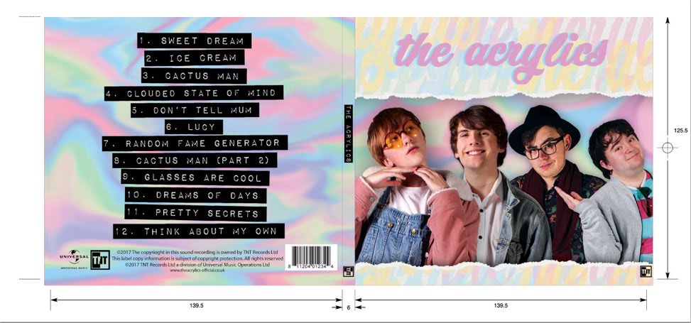
| Interior. |
It consists of a focal image of each of the band members
descending in size, in order of importance to the band; Casey, Hugh, Guy, then
Terrence. Additionally, there is a simple, hand-drawn background and logo,
conveying our image and branding, whilst also informing the audience of who we
are. The inside panels will have photos of the band member’s being shared over
a table, highlighting the friendship amongst the members of the band, and
providing the audience with some extra content that will engage them in our
band. The back cover is bold lettering (possibly cut out from a magazine/pieces
of paper) over a simple, hand-drawn background. This is easy to read, and
extends the band aesthetic and branding.
Our audeince feedback told us that it was important to have all of our band members shown on the front cover of the digipak, as it gave them a sense of the band. We also found out that the audeince like a visually engagin inside panel that complements the music, which is why we have chosen to go with the covered table inside panel.


No comments:
Post a Comment