
 |
| Me photoshopping the digipak. |
THE STEPS I TOOK TO MAKE THE DIGIPAK:
- First I chose and cropped photos of each of the band members.
- I then graded and positioned each of the band members on the album cover. At this point we were still deciding our exact design, as we hadn't planned exact spacing of the models before (we knew they would be a different size to how we were expecting).
- I created a background for the album cover using the paint, smudge, and burn tool on photoshop. This allowed me to get an inky effect on the background, adding to the dreamy aesthetic of our album cover.
- I chose fonts to use for the song and album titles that would suit our band's aesthetic.
- As a group, we took the photo for the inside of the digipak, which would take up both inside panels. The photo was of a table covered in items that were related to our band and our album, such as photos and objects from our past.
- I graded the photo for the inside panels of the digipak so that it appeared more saturated and clear.
- I added some of the finishing touches, such as a bar code, copyright symbols, and extra bits of grading to solidify the aesthetic.
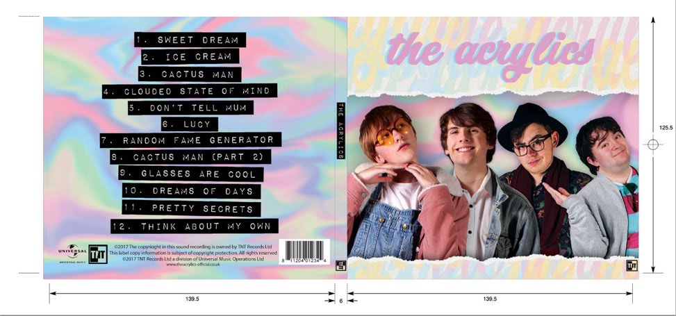
THE CONVENTIONS WE INCLUDED:
- Album/band name
- Focal image of our band members
- Bar code
- Copyright symbols
- Record label logo
- Song titles
WHAT I LEARNED:
- I learned a lot about using photoshop, because although I had already used it a lot in the past, I found that this project allowed me to develop my creative skills with photoshop, exploring different ways to create things.
- I also learned a lot about the conventions of an album cover that I had not previously considered. For example, I had never previously thought about copyright and record label on an album cover, but this project showed me the importance of informing an audience of the institution aspect of music.
 |
| These are the interior panels of our digipak. On the left are many objects and photos that link to the album. On the right there is a dream catcher, referencing the single on our album, while also being a subtle piece of imagery once the CD is removed from the case. |
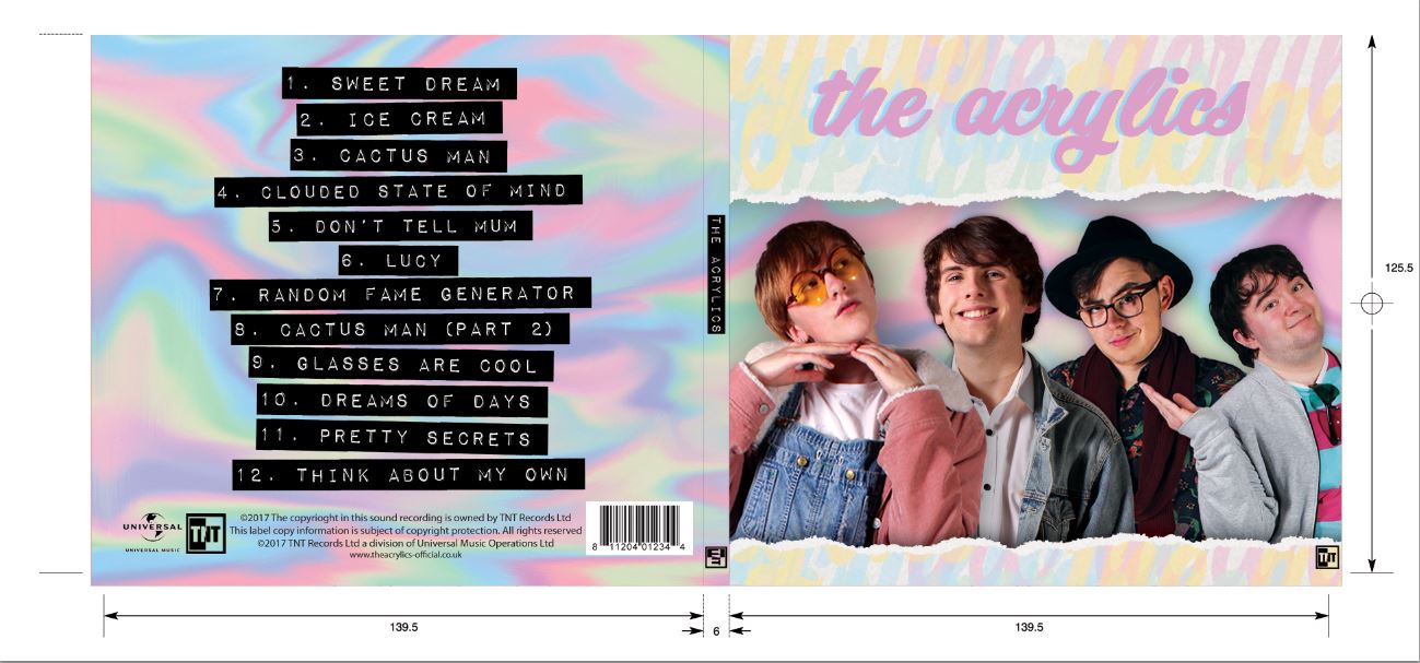 |
| These are the exterior panels of our digipak. The right is the front of the album cover, and includes a focal image of our band wiht the band name on it. The spine simply says the band's name and the record label. The left is the back of the album cover, and has a list of song, a bracode, copyright symbols, and record labels. |
Our teachers also said that the information was very clear on the album cover, and they both agreed with the fact that the inside panels work well with the music and the theme of the album.
No comments:
Post a Comment