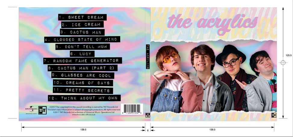

ALBUM COVER CONVENTIONS:
- Name of the band and album
- The record label and logo
- Year released
- Barcode label
- Square from factor
- Song titles/track listing
- Distributor
- Name of the sound format
- Website information
- Record label and album title on spine
- Extra info. on the sleeve/booklet.
- Copy right symbol
- Credits and thank yous on the back cover
- Promo sticker
- Lyrics sheet/lyrics on the back
- A focal image
 |
| Cream - Disraeli Gears. |
This album was released in 1967 and reflects the "hippie" movement of the time with the chaotic graphics and pink, red, and yellow colour scheme. It seems drug-induced, which was a big part of hippie culture. The artist, Martin Sharp, used cut outs from Bob Whitaker's promo shots of the band, mixed with cut outs from various books. This artwork really represents the music, which Sharp calls a "warm, fluorescent sound". The album title is in the centre in small letters with the band name in large, colourful letters taking the focus. The focal image is hard to focus on in this album cover and is the image of the band members, which, among all of the cartoon design, connects the band to their music.
 |
| Adele - 21 |
This album cover was shown by Sian and Meera during lesson time, and I thought it was a perfect example of a simple but effective album cover. The focal image is a close up Adele, the singer. There is also simple white text stating her name followed by green text with the album name on it. The photo is in black and white so there is a clear sense of style, with the white and green writing standing out so the album and artist names are noticeable and memorable.
 |
| LCD Soundsystem - The Influences |
No comments:
Post a Comment